Pascal Oparada
Brands deliberately adopt colours in order to stand out from the pack. Even if the brand is offering the same service like others in the same sectors, colours can make a brand stand out.
But colour experts believe that people interpret colours differently and patronise them accordingly.
The psychology of colour can help your business establish trust and familiarity by eliciting the right emotions. It’s no surprise that the most popular brands in the world have a strong association with their logos. Their colours tend to reflect their branding, even when they don’t involve any text on them.
This is due to the power of colours and their ability to increase brand recognition with the desired reactions that they may provoke. Studies have found that a product’s colour influences 60 to 80% of a customer’s purchasing decision. This means that the right choice of colour does not only strengthen the brand association, but it can also affect your total sales.
READ ALSO:http://Buhari is a ruler, not a leader –Bishop Okoh
Imagine why Coca Cola continues to use red as its colour over the last 300 years. That is because the colour evokes passion and excitement.
Rather than give in to those who hold the superstitious belief that red means danger, many brands in Nigeria, including banks like UBA and Zenith, have gone on to adopt and own the colour red.
Think of the reason MTN has stuck to yellow as its brand colour. In fact, when it set up shop in Nigeria, many people could easily relate to it because it adopted the same colour as the colour of transportation in Lagos, Nigeria’s commercial hub.
Yellow stands for happiness, optimism and youth. Are you surprised that MTN is the most successful telecoms operator in Nigeria and appeals to the youths more?
MaxOkada is capturing hearts of commuters in Lagos with its distinct yellow coloured bikes.
As a marketer, it is useful to explore how the psychology of colours can send the right message to your target audience. Your brand’s colours should be integrated across your website, your landing pages, your logo, your product and any other collateral that you’re creating. Stronger branding increases the impact of seeing the right use of colours making an impact on your business.
How people respond to colours
Every colour elicits a different response from humans. Colours can be divided into two main categories: warm and cool. Warm colours tend to be associated with energy, while cool colours are linked with calmness and security.
But how does each of the following colours affect us and what does that mean for your brand? Here’s an overview of what differentiates each colour and how your brand can pick the right mix of them.
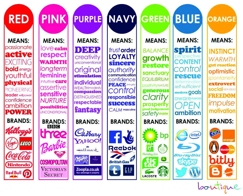
Red
Red evokes a passionate and intuitive response. It is a colour that increases your heart rate, makes your breath faster, and is generally associated with energy, excitement and passion. It’s one of the colours that are attention-grabbing, while it can also be provocative and excitable.
Purple
Purple is a sophisticated yet mysterious colour. It tends to be used with higher-end products due to its association with royalty and elegance. Purple’s mysterious element is also linked with spirituality and it can bring a magical element to your branding.
Blue
Blue is the most popular colour choice for the top brands. Microsoft, Intel, Facebook and a host of other big brands have adopted it.
It is thought to put people at ease, as it reminds them of the sky and the ocean. Blue is also associated with trust, security, and confidence which make a great combination for the brands that want these elements in their message.
Green
Green is a colour that is synonymous with calmness, safety, and freshness. Its various shades can create a unique brand identity for your company. Green tends to be associated with health along with the feelings of peace and serenity.
Yellow
Yellow is a popular colour choice for brands that want to evoke a feeling of positivity in their identity. Its association with the sun on its different shadows brings out hope and optimism. Yellow also stands out among other colours, which makes a yellow brand identity creative and appealing.
Orange
Orange makes an ideal colour choice for brands that want to blend the optimism and the brightness of yellow and the passion and the energy of red. It is a creative and cheerful colour that evokes a friendly and adventurous feeling.
READ ALSO:http://PDP is the party of choice for Bayelsans –Okorotie
Brown
Brown represents the earthly simplicity and it is usually preferred to reflect stability and strength. It’s comforting in its simplicity and is preferred by brands that want to be classical and trustworthy, without proceeding to bold moves. Brown is associated with the earth and can also remind people of dirt, so there is a need for the careful use of it, especially if it stands out as the main colour for a brand.
Black
Black is another popular colour option for brands and it tends to be one of the most classic options. It’s both classic and sophisticated and it can make a brand identity stand out. It seems to work perfectly with luxury products, blending the classic and powerful elements. Black is one of the colours that can be combined with others to add a stronger emotion, without losing the classical appeal.
White
White represents simplicity, purity and also cleanliness. These three make it extremely popular in the healthcare sector, in the cleaning business, but also in the child-related businesses. White can also bring out a feeling of trust by tapping into purity and simplicity.
It’s important to understand the psychology of each colour when creating your brand’s identity. Your colour choice can build your brand’s aesthetic while also bringing you closer to your target audience. Use the colours that will highlight your brand’s strengths, evoking the right feelings for the right audience.